Abstract
The growing capabilities of multimodal large language models (MLLMs) have advanced tasks like chart understanding. However, these models often suffer from hallucinations, where generated text sequences conflict with the provided visual data. To address this, we introduce Post-Hoc Visual Attribution for Charts, which identifies fine-grained chart elements that validate a given chart-associated response. We propose ChartLens, a novel chart attribution algorithm that uses segmentation-based techniques to identify chart objects and employs set-of-marks prompting with MLLMs for fine-grained visual attribution. Additionally, we present ChartVA-Eval, a benchmark with synthetic and real-world charts from diverse domains like finance, policy, and economics, featuring fine-grained attribution annotations. Our evaluations show that ChartLens improves fine-grained attributions by 26-66%.
The problem
Charts carry exact quantities, trends, and comparisons, and MLLMs are increasingly asked to answer questions about them. When such a model hallucinates, the text looks plausible but disagrees with the image, and a reader has no quick way to tell. Text-based LLMs mitigate this with attribution: citations that let a user trace a claim to its source. Charts have had no equivalent. If an answer cannot be linked to specific bars, points, or sectors, there is no way to verify whether it is grounded in the data or in a hallucinated pattern.
We define Post-Hoc Fine-grained Visual Attribution for Charts: given a chart and a response, return the set of chart regions that support the response, with the criteria of relevance, completeness, and precision. Post-hoc attribution is a plug-and-play layer that works with any underlying chart QA system and keeps attribution separate from answer generation.
Approach
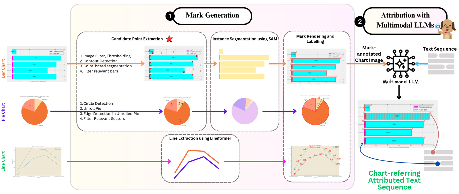
ChartLens has two stages: generate referable marks for the chart’s elements, then let an MLLM pick the marks that support the response.
- Heuristic-guided instance segmentation for bars and pies. Bar charts are binarized with Otsu thresholding on RGB and HSV, contours are split by unique pixel values into individual bars, and spurious contours are filtered by solidity and area. Pie charts are located by the largest contour and its enclosing circle, unrolled along the radial axis, and sector boundaries are detected as edges in the unrolled image. Points sampled from each candidate are then passed as prompts to the Segment Anything Model (SAM), which produces clean masks and naturally suppresses grid lines and labels.
- Transformer-based line segmentation. Lines are thin, overlapping, and often intersect, so we use LineFormer to extract them, then divide each line into equally spaced segments along its horizontal extent to serve as fine-grained marks.
- Set-of-Marks prompting. The segmented elements are overlaid with alphanumeric labels. The MLLM receives the marked chart with a prompt that explains chart attribution, gives few-shot textual examples, and asks for chain-of-thought reasoning in two steps: validation (is the QA pair consistent with the chart?) and attribution (which labeled elements support the answer?). For line charts, the model returns pairs of marked points between which the attribution lies.
ChartVA-Eval. We build the benchmark from three sources: ChartVA-AITQA (synthetic charts rendered from airline SEC filing tables in MATSA-AITQA, with many style variations), ChartVA-PlotQA (synthetic scientific charts from World Bank Open Data, Open Government Data, and the Global Terrorism Database), and ChartVA-ChartQA (real-world charts from Statista, Pew Research, Our World in Data, and OECD, with pie charts oversampled). Questions span retrieval, reasoning, and computation. For ChartQA and PlotQA we generate initial attributions with GPT-4o from the underlying tables and templates, then have annotators verify relevance and completeness (Cohen’s kappa 0.89 and 0.84).
| ChartVA-AITQA | ChartVA-PlotQA | ChartVA-ChartQA | |
|---|---|---|---|
| # of queries | 301 | 595 | 348 |
| # of charts | 301 | 581 | 266 |
| Bar / pie / line charts | 203 / 0 / 98 | 396 / 0 / 199 | 121 / 109 / 118 |
| Chart source | Synthetic | Synthetic | Real world |
| Multiple attributions | No | Yes | Yes |
| Avg. / max # of attributions | 1 / 1 | 2.4 / 12 | 1.43 / 8 |
| Avg. / max # of data series | 1.23 / 8 | 2.52 / 4 | 2.45 / 14 |
Source: Table 1 of the paper. Statistics of the three ChartVA-Eval subsets.
Example
The paper’s Figure 1 shows a PlotQA-style bar chart of the number of documents required per shipment to import goods, by country and year (2005, 2006, 2007). Attribution grounds each answer to specific bars, and a reader can then check the answer against those bars.
Input: chart + question + response
Attribution
Input: chart + question + response
Attribution

The paper’s Figure 3 compares the attributions returned by each method on a pie, bar, and line chart.
Pie chart
Bar chart
Line chart

Each ChartVA-Eval row in the released benchmark pairs a question and answer with the attributed regions (bounding boxes for bars and sectors, points for lines). A line-chart sample from the ChartVA-AITQA subset:
question:   How much money did United spend for aircraft fuel in 2016?
answer:     United spent $5,813 on aircraft fuel in 2016.
chart_type: line
bboxes:     [{"x1": 684.5, "y1": 2564.9}]
Results
Baselines: zero-shot GPT-4o bounding-box prompting, Kosmos-2, and LISA. ChartLens uses GPT-4o as its MLLM, facebook/sam-vit-large for SAM, and LineFormer. Bars and sectors are matched to ground truth by IoU and scored with precision, recall, and F1; lines are scored by detection rate (fraction of ground-truth points covered) and the percentage of chart area covered.
| Method | Bar: AITQA F1 | Bar: PlotQA F1 | Bar: ChartQA F1 | Pie: ChartQA F1 |
|---|---|---|---|---|
| Zero-shot GPT-4o | 22.77 | 3.30 | 7.75 | 7.17 |
| Kosmos-2 | 0.51 | 1.01 | 3.13 | 11.70 |
| LISA | 1.62 | 0.34 | 1.01 | 2.41 |
| ChartLens | 69.28 | 34.65 | 64.14 | 48.56 |
Source: Tables 2 and 4 of the paper. F1 of predicted attributions against ground truth (IoU matching) on the three ChartVA-Eval subsets. Higher is better.
| Method | AITQA det. % | AITQA area % | PlotQA det. % | PlotQA area % | ChartQA det. % | ChartQA area % |
|---|---|---|---|---|---|---|
| Zero-shot GPT-4o | 18.28 | 1.94 | 6.79 | 8.63 | 3.39 | 1.15 |
| Kosmos-2 | 74.19 | 46.03 | 38.83 | 27.06 | 87.29 | 41.49 |
| LISA | 94.62 | 63.18 | 50.21 | 40.92 | 50.21 | 40.92 |
| ChartLens | 59.14 | 1.25 | 51.84 | 9.98 | 77.8 | 5.34 |
Source: Table 3 of the paper, line charts. Detection % is the fraction of ground-truth points covered (higher is better); area % is the share of the chart flagged (lower is better).
- Bar charts. ChartLens reaches F1 of 69.28 on ChartVA-AITQA (precision 79.86, recall 61.17), 34.65 on ChartVA-PlotQA, and 64.14 on ChartVA-ChartQA, against 22.77, 3.30, and 7.75 for zero-shot GPT-4o; Kosmos-2 and LISA stay below 5 F1.
- Pie charts. F1 of 48.56 (precision 53.33, recall 44.57) against 7.17 for GPT-4o, 11.70 for Kosmos-2, and 2.41 for LISA.
- Line charts. LISA and Kosmos-2 achieve high detection mainly by covering large regions of the chart; ChartLens reduces the area flagged by 3 to 50 times while keeping detection rates of 59.14%, 51.84%, and 77.8%.
- Across chart types this amounts to a 26-66% improvement in fine-grained attribution over the baselines. Qualitatively, GPT-4o attempts specific selections but cannot localize reliably through text coordinates, while LISA and Kosmos-2 tend to return generic components such as the whole pie regardless of the query.
Resources
- arXiv: 2505.19360
- ACL Anthology (ACL 2025 Long Papers)
- Code and ChartVA-Eval benchmark on GitHub
- Hugging Face Papers
- Adobe Research publication page
- Explainer post: ChartLens
- Related on this site: VisDoM, multimodal document QA over charts, tables, and slides
- All publications
Quick start
From the repository README: load a ChartVA-Eval subset and parse its attribution annotations.
import pandas as pd
import json

# Load dataset
df = pd.read_csv('data/matsa_dataset.csv')   # or chartqa_dataset.csv, plotqa_dataset.csv

# Parse visual attributions
def parse_attributions(bbox_str):
    return json.loads(bbox_str) if bbox_str else []

df['attributions'] = df['bboxes'].apply(parse_attributions)

sample = df.iloc[0]
print(f"Question: {sample['question']}")
print(f"Answer: {sample['answer']}")
print(f"Attributions: {sample['attributions']}")
Line charts store point coordinates ({"x1", "y1"}); bar and pie charts store bounding boxes ({"x1", "y1", "x2", "y2"}). Images live under images/MATSA, images/ChartQA, and images/PlotQA.